
Your business sign is often one of the first things customers notice. A well-designed sign can strengthen your brand, improve visibility and make your business easier to recognize. But a poorly designed sign can have the opposite effect.
Whether you are opening a new business, updating an existing storefront or rebranding your company, avoiding common design mistakes can help you get more value from your signage investment.
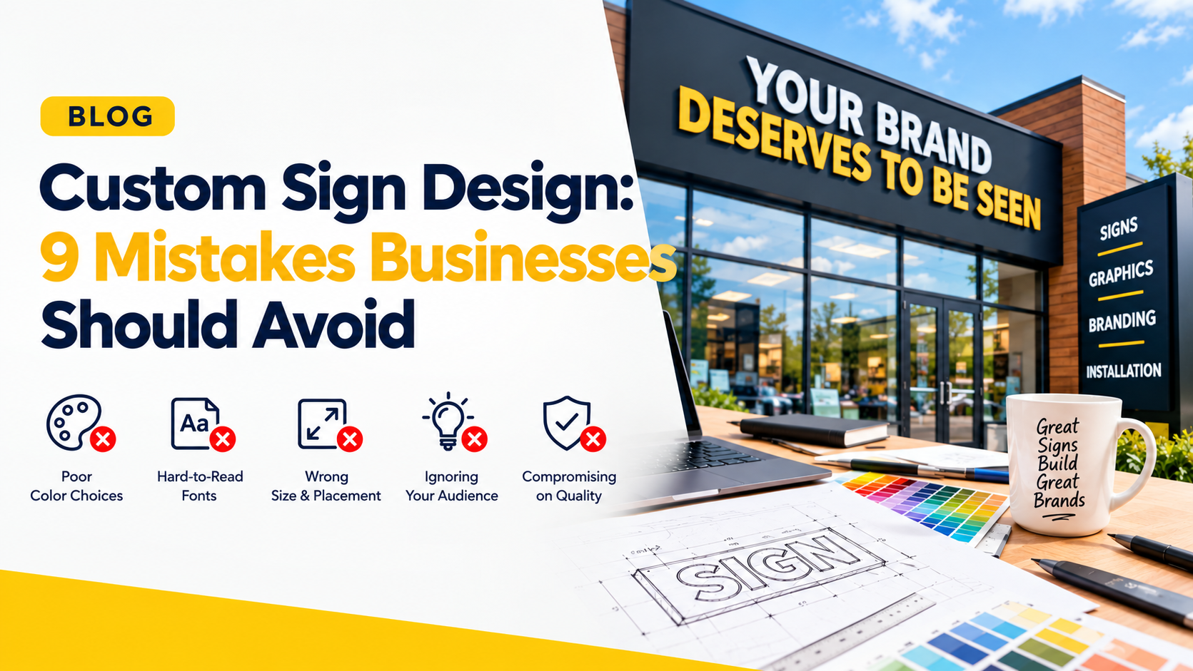
Here are 9 custom sign design mistakes businesses should avoid.

1. Using Too Much Information
One of the most common mistakes is trying to put everything on one sign.
Business owners may want to include their company name, tagline, phone number, website, services, social media handles and promotional messages. The result can be a cluttered design that customers cannot understand quickly.
Better approach: Focus on the most important message. Your business name and logo should usually receive the most attention.
Thin lettering, overly decorative fonts and complicated scripts can reduce readability, particularly when customers are viewing your sign from the road.
2. Choosing a Difficult-to-Read Font
Creative fonts can look attractive on a computer screen but may become difficult to read when installed on a building.
Choose fonts that are bold, clean and easy to recognize from a distance.
3. Ignoring Colour Contrast
Your sign’s colours should help the message stand out rather than blend into the background.
For example, light lettering on a light background can become difficult to see. The same problem can happen with dark lettering against a dark building exterior.
Consider your building’s existing colours when choosing the sign background and lettering.

4. Making the Sign Too Small
A design that looks perfect on a laptop may look surprisingly small once installed on a building.
Before finalizing your custom sign, consider:
- Viewing distance
- Traffic speed
- Building size
- Pedestrian visibility
- Surrounding signs and structures
The goal is not simply to make a sign bigger. It is to make sure the important information is visible at the distance customers will actually see it.
For businesses considering different custom signage solutions, explore custom signs in Mississauga to see the range of options available.

5. Designing Without Considering the Location
A sign should be designed for the building where it will actually be installed.
The wall material, building colour, available space, nearby structures, viewing angles and surrounding environment can all affect how your sign looks.
This is why professional sign planning should consider the actual installation location rather than relying only on a digital mockup.
6. Forgetting About Nighttime Visibility
If your business operates during the evening, your sign should remain effective after sunset.
A design that looks excellent during daylight may lose its impact at night if illumination is not considered.
Depending on the design and location, options such as illuminated lettering or other lighting solutions can help maintain visibility.
For example, channel letters can provide a strong branded appearance for commercial properties while also offering illuminated options.
7. Ignoring Your Brand Identity
Your sign should look like your business, not a generic template.
Use your established:
- Logo
- Brand colours
- Typography
- Visual style
- Brand personality
Consistent branding helps customers recognize your business across your storefront, website, social media and other marketing materials.
A custom sign can incorporate unique logos, colours, graphics, lettering, shapes and sizes to create a more distinctive business identity.
8. Choosing Materials Based Only on Appearance
A material may look great in a design mockup but may not be the right choice for the actual environment.
Outdoor signage in Mississauga needs to withstand changing weather conditions, while indoor signage has different requirements.
Think about:
- Indoor vs. outdoor use
- Weather exposure
- Maintenance
- Expected lifespan
- Mounting surface
- Overall appearance
Choosing the appropriate material during the design stage can help prevent problems later.
9. Skipping Professional Installation Planning
Even an excellent sign design can lose its impact if the installation is poorly planned.
Placement, mounting method, visibility, site conditions and applicable requirements should be considered before fabrication and installation.
Professional installation can also help ensure that the sign is securely mounted and positioned correctly. Signs Depot’s sign installation service includes considerations such as site assessment, design approval, preparation, installation and testing.
Create a Custom Sign That Works for Your Business
A successful custom sign is more than an attractive graphic. It needs to be clear, readable, properly sized, brand-consistent and suitable for its location.
Avoiding these nine mistakes can help your business create signage that looks professional and communicates your brand effectively.
If you are planning a new business sign in Mississauga, explore Signs Depot’s custom signage solutions or request a quote for your project. Signs Depot provides custom signage solutions designed around your business’s branding, location and visibility requirements.