
A business sign is often the first thing customers notice when they arrive at your store or pass by your location. A well-designed sign can help people recognize your business, understand what you offer, and find your location more easily.
But simply having a sign is not enough. If the letters are too small, the colours blend into the background, or there is too much information, people may have trouble reading it.
So, how do you make a business sign easy to read?
The key is to keep the design clear, simple, and easy to see from a distance. From choosing the right font to using strong colour contrast and proper lighting, several small details can make a big difference.
1. Choose a Simple and Clear Font
The font you choose has a major impact on how readable your business sign will be.
While decorative fonts can look attractive, they are not always easy to read from a distance. This is especially important for signs that customers will see while walking, driving, or entering a parking area.
Choose fonts with:
- Clear and simple letter shapes
- Medium or thick strokes
- Enough space between letters
- Good readability from a distance
- A style that matches your business
Try to avoid overly decorative, complicated, or very thin fonts for your main business name.
Your sign should look professional, but customers should also be able to understand it within a few seconds.

2. Make the Letters Large Enough
One of the biggest mistakes businesses make is using lettering that is too small.
The right letter size depends on where your sign is located and how far away customers will be when they see it. A sign above a storefront may need larger letters if it is intended to be seen from across a parking lot or from the road.
Before finalizing your sign, consider the distance from which people will normally see it.
Ask yourself:
Can someone read my business name without standing directly in front of the sign?
If the answer is no, the lettering may need to be larger.
For businesses looking for exterior signs in Mississauga, considering viewing distance during the design stage can help create a sign that is both attractive and practical.
3. Use Strong Colour Contrast
Colour contrast is another important part of readable business signage.
Your lettering should stand out clearly against the background. If the text and background are too similar in colour, the words can become difficult to see.
For example, dark lettering on a light background generally creates strong contrast. The same applies to light lettering on a dark background.
On the other hand, light grey text on a white background may be difficult to read, particularly from a distance.
Your brand colours are important, but they should be used in a way that keeps the main message easy to see.
A good business sign should make the lettering stand out rather than forcing customers to concentrate to read it.
4. Keep the Message Short
A business sign should communicate the most important information quickly.
You do not need to put everything about your business on your sign. Too much text can make the design look crowded and make it harder for customers to understand the main message.
For example, instead of using a long sentence describing your business, focus on:
- Business name
- Logo
- Type of business
- Short tagline
- Important information, if necessary
Your business name should normally be the most noticeable element.
A simple message that can be understood quickly is usually more effective than a sign filled with information.

5. Give Your Design Enough Space
Good spacing can make a business sign much easier to read.
If letters are packed together, customers may struggle to understand the words. The same problem can happen when there is not enough space between different lines of text or between the logo and business name.
Give each element enough room to breathe.
A clean design should have a clear visual hierarchy. The business name should stand out first, followed by supporting information.
This is one reason professional custom business signs are designed according to the business, location, and intended viewing distance.
6. Consider Illuminated Signage
A sign that looks great during the day may not be as effective at night.
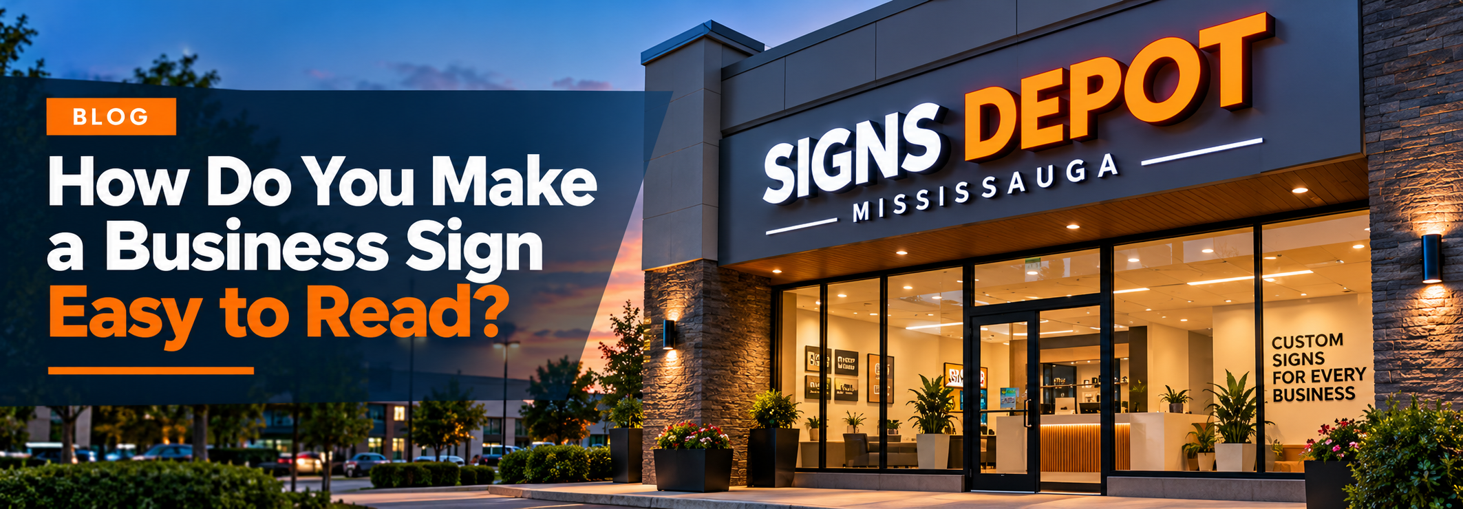
If your business operates during evening hours, lighting can play an important role in visibility. An illuminated sign can help customers recognize your business when natural light is low.
There are different types of illuminated signage available, including channel letters, illuminated sign boxes, and halo-lit signs.
For example, sign boxes can use internal lighting to make the sign more visible after dark.
The goal should not simply be to make the sign bright. The lighting should help the business name and important information remain clear and easy to read.
7. Think Carefully About Sign Placement
Even the best-designed business sign will not work well if customers cannot see it.
Before installing a sign, consider the surrounding environment.
Is the sign:
- Blocked by trees?
- Hidden behind another sign?
- Too high?
- Too low?
- Difficult to see from the road?
- Obstructed by parked vehicles?
The sign should be positioned where your target customers are most likely to see it.
For example, storefront signs in Mississauga should be positioned so they are easy to notice as customers approach the business.
Good placement can be just as important as the sign’s design.
8. Make the Business Name the Main Focus
When someone sees your sign, they should immediately know which business they are looking at.
Your business name should normally be the most prominent element on the sign. Your logo, tagline, phone number, website, or promotional message can support the main message without competing with it.
A simple structure can work well:
Business Name
Type of Business or Short Tagline
This makes the sign easier to scan and understand.
If every element on the sign is large, colourful, or bold, nothing will stand out. Give the most important information the strongest visual emphasis.
9. Design for the Viewing Distance
Think about how customers will actually see your sign.
A sign inside a shopping centre may be viewed from a short distance. A building sign facing a busy road may need to be readable from much farther away.
This affects:
- Letter size
- Font choice
- Colour contrast
- Lighting
- Amount of text
- Sign placement
Designing the sign around the real viewing environment can help improve its effectiveness.

10. Test the Sign Before Installation
Before approving the final design, take a step back and look at it from different distances.
You can also take a photo of the proposed design and view it on your phone. Try looking at it quickly rather than studying every detail.
Can you immediately identify the business?
Can you read the main message?
Does the business name stand out?
If the answer is yes, the design is likely working well.
If you need to concentrate to understand the sign, consider simplifying it before production.
What Makes a Business Sign Easy to Read?
A readable business sign does not need to be complicated. In most cases, the most effective designs focus on a few important principles:
- Use a simple, readable font
- Make the letters large enough
- Create strong contrast between text and background
- Keep the message short
- Use proper spacing
- Consider illumination for nighttime visibility
- Choose the right installation location
- Make the business name the main focus
- Design according to viewing distance
These simple choices can help your sign communicate your message more effectively.
Create a Business Sign That Gets Noticed
A good business sign should do more than look attractive. It should help customers recognize your business quickly and understand your message without having to stop and study the sign.
Whether you need a storefront sign, building sign, channel letters, sign box, or another type of custom business signage, the design should always consider readability and visibility.
For businesses in Mississauga, choosing the right sign design can help create a stronger presence and make it easier for customers to find you.
The best business sign is one that customers can see, read, and remember.