

How Far Away Should Your Building Sign Be Visible?
A building sign may look perfect from the sidewalk, but what happens when a customer is approaching from across a parking lot or driving along a busy road?
For businesses in Mississauga, sign visibility should be considered before deciding on letter size, placement, colours or illumination. There is no single viewing distance that works for every property. The right distance depends on where customers approach from, how quickly they are moving and the environment surrounding your business.
Here is what to consider when planning building signs in Mississauga.

1. Start With Where Customers Will See Your Sign
Before deciding how large a sign should be, identify its main viewing point.
Will customers see it:
- From the sidewalk?
- Across a parking lot?
- From a moving vehicle?
- From the opposite side of the road?
- From the entrance to a shopping plaza?
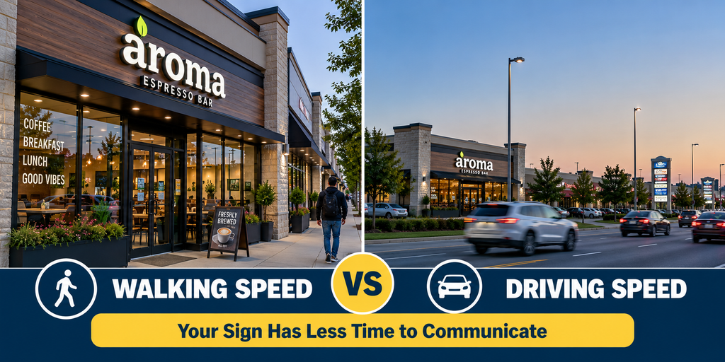
A pedestrian-facing storefront and a commercial building beside a major road have very different visibility requirements.
For street-level locations, storefront signs can be designed around both pedestrian and vehicle traffic.
2. Greater Viewing Distance Usually Requires Larger Letters
As the distance between the viewer and the building increases, smaller lettering becomes harder to recognize.
For example, an office entrance sign may only need to communicate with someone relatively close to the building. A warehouse or roadside business may need customers to recognize its name much earlier.
Instead of choosing letter size based only on how it looks on the façade, consider how it appears from the customer’s actual approach.
3. Traffic Speed Changes How Quickly a Sign Must Be Read
Viewing distance is only part of the equation.
A pedestrian has more time to look at a sign than someone travelling in a vehicle. That means roadside signage generally needs to communicate information quickly.
Simple wording, recognizable branding and clear letterforms become especially important.
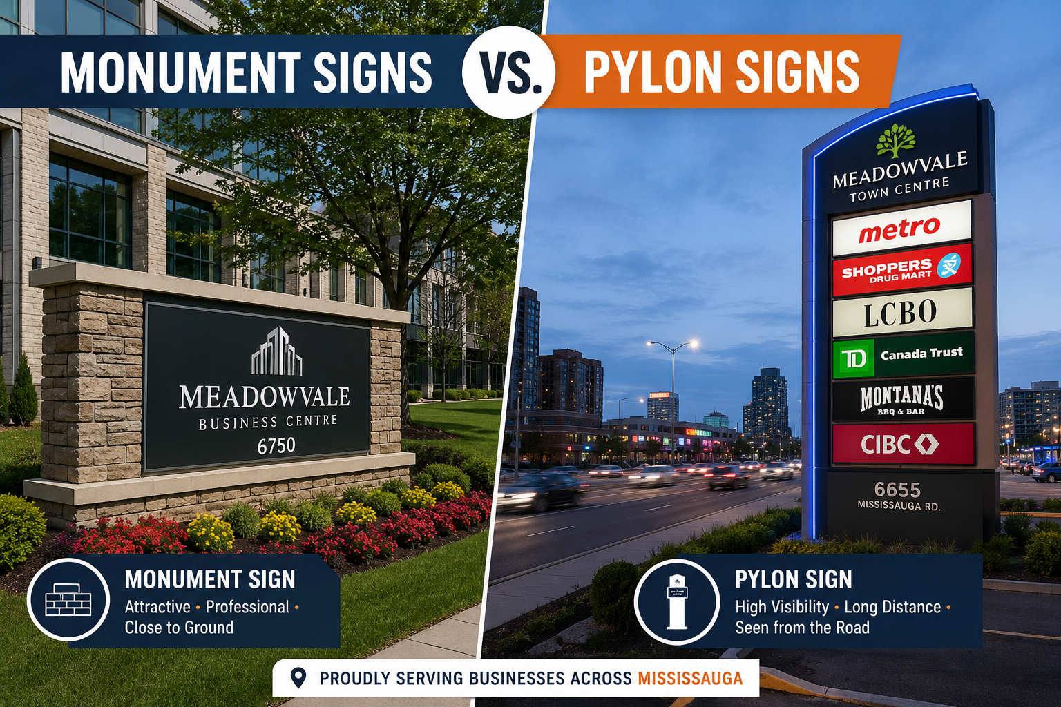
For businesses that need visibility from surrounding roads or large parking areas, pylon signs can provide another identification point separate from the building itself.
4. Letter Size Is Only One Part of Visibility
Making letters bigger does not automatically make a sign effective.
Visibility also depends on:
Contrast – Letters should stand apart from the background.
Font – Complicated lettering can become difficult to recognize from farther away.
Spacing – Crowded letters reduce readability.
Placement – Trees, neighbouring signs and architectural features can obstruct the view.
Lighting – Businesses operating after dark need to consider nighttime visibility.
This is why custom signs in Mississauga should be designed around the actual property rather than viewed only as a standalone graphic.
5. Building Height and Sign Placement Matter
Where the sign sits on the façade can be just as important as its dimensions.
A sign mounted too low could be blocked by parked vehicles. A sign installed very high may need larger lettering to remain readable from ground level.
Before production, examine the property from several locations where customers are likely to approach.
Take photos from the:
Road • Parking entrance • Parking lot • Sidewalk • Main entrance
This provides a much better picture of real-world visibility.
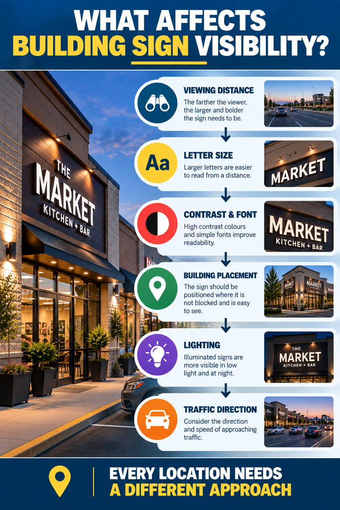
6. Don’t Forget Night Visibility
A sign that performs well at noon may almost disappear after sunset.
Businesses open during the evening should evaluate how their signage looks after dark. Channel letter signs are one option because individual letters can incorporate illumination.
Other applications can use internal or external lighting depending on the design.
7. Test Visibility Before Manufacturing
One useful step is to visualize the proposed sign on the actual building before fabrication.
Ask:
Can customers recognize the business from the road?
Is the company name clear from the parking entrance?
Does another sign or architectural element block it?
Will the lettering still stand out at night?
Does the design contain unnecessary information?
Testing these details beforehand can prevent a sign that looks attractive up close but becomes difficult to recognize from the customer’s normal viewing position.
Design Building Signs for Real-World Visibility
There isn’t one ideal viewing distance for every building sign in Mississauga. A small professional office, busy retail plaza and roadside warehouse each require a different approach.
Start with the customer’s viewing position and work backwards. Consider distance, traffic speed, letter size, contrast, placement and illumination together.
Signs Depot can create custom building signs in Mississauga for different commercial properties and visibility requirements.